


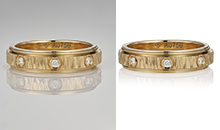

In the competitive world of e-commerce, colour accuracy is the bridge between a customer’s expectation and their reality. For jewellery, where a slight shift in hue can turn premium 18K yellow gold into cheap-looking brass, precision is everything.
Unlike fashion or lifestyle products, jewellery is unforgiving. A tiny colour change can alter the perceived purity of gold, the value of gemstones, and even the trustworthiness of your brand.
By the end of this guide, you will know how to calibrate your workspace, use hardware reference tools, and apply advanced Photoshop techniques to achieve up to 99% colour fidelity in your jewellery photography—no matter where your customers are viewing your products worldwide.
Why Colour Accuracy Tips for Jewellery Photography Editing Matter Worldwide
When a customer buys a sapphire ring online, they expect the deep “Royal Blue” shown in the photo. If the product arrives looking like a light “cornflower blue”, you haven’t just lost a sale—you’ve lost trust.
Worldwide selling makes this even harder because jewellery photos are viewed on:
- iPhones with bright OLED screens
- Android phones with boosted saturation
- Laptops with poor colour display
- Desktop monitors with different profiles
If your editing is not controlled, the same ring can look like three different products across devices.
The Impact in Numbers (Why This Isn’t a Small Issue)
Colour mismatch is one of the most expensive eCommerce problems.
Here’s what it can cost:
- 22% of returns in online retail happen because the product looks different in person than in the photo.
- 58% of consumers say they will not buy again if the colour is misrepresented even once.
- Jewellery images edited with calibrated sRGB profiles can see up to a 15% higher click-through rate compared to unmanaged colour files.
If you’re serious about selling jewellery worldwide, these numbers make one thing clear:
Accurate colour = fewer returns + more conversions + stronger brand trust.
Colour Accuracy Tips for Jewellery Photography Editing: Start Before You Edit
Most colour problems are created during shooting, not editing.
Jewellery is reflective, which means it captures:
- your light source colour
- your wall colour
- your background tone
- your clothing colour
- even green reflections from trees near a window
So the goal is not “fix it later”.
The goal is: Capture neutral colour so editing stays clean and realistic.
Colour Accuracy Tips for Jewellery Photography Editing With Proper Workspace Setup
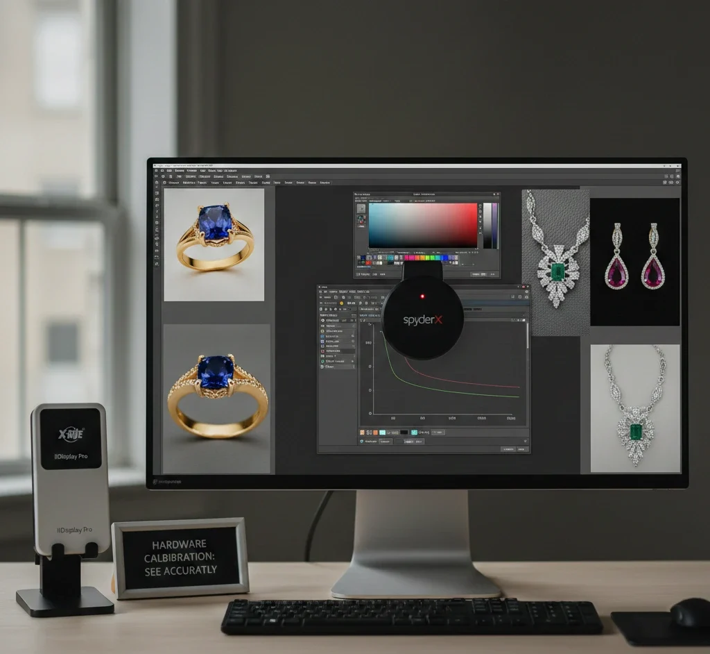
1) Use Hardware Calibration for Your Monitor (Non-Negotiable)
You cannot edit what you cannot see.
Most consumer screens are designed to look “vibrant”, not accurate. They often lean:
- too blue (cool)
- too pink (magenta)
- too bright (makes you export dark images)
To achieve professional colour accuracy tips for jewellery photography editing, use a hardware calibrator like:
- SpyderX
- X-Rite i1Display
These devices measure the light coming from your screen and create an ICC profile that standardises your monitor.
Recommended calibration targets:
- Target Gamma: 2.2
- White Point: 6500K (D65)
- Brightness: 100–120 cd/m²
This gives you a neutral baseline so gold looks like gold, silver looks clean, and gemstones stay realistic.
If you edit jewellery without a calibrated monitor, you are guessing. And guessing leads to returns.
2) Control Your Editing Environment (Yes, It Affects Jewellery Colour)
Even your room lighting can shift how you perceive colour.
For worldwide accuracy:
- Avoid editing under warm yellow room lights.
- Avoid strong coloured LED lights.
- Use neutral lighting around your desk if possible.
Quick upgrade: A neutral daylight desk lamp (around 5000K–6500K) helps you judge jewellery tones better.
Colour Accuracy Tips for Jewellery Photography Editing Using Reference Tools
3) Implement the “Grey Card Workflow” for Instant White Balance Accuracy
Camera sensors struggle with reflective surfaces like silver and gold. That’s why jewellery often gets a colour cast:
- silver becomes blue
- Gold becomes orange.
- Diamonds look yellowish.
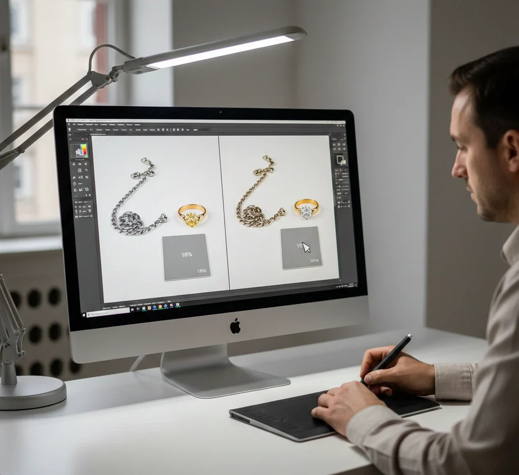
Using an 18% grey card is the most cost-effective fix.
Shooting Phase (30 seconds that saves hours)
- Place the grey card next to the jewellery under the same lighting.
- Take one photo with the card visible.
- This becomes your neutral reference.
Editing Phase (Lightroom / Camera Raw)
- Open the RAW file in Lightroom or Adobe Camera Raw.
- Select the White Balance Eyedropper Tool.
- Click on the grey card.
- Sync those settings across all photos in that lighting setup.
This removes unwanted tints instantly and keeps metal looking natural.
This is one of the strongest colour accuracy tips for jewellery photography editing because it creates repeatable consistency.
4) Leverage Colour Checker Passports for Gemstones (Emeralds, Rubies, Sapphires)
Gemstones are difficult because cameras don’t “see” colour like humans do.
Example:
An emerald may shift toward teal because many sensors struggle with green wavelengths.
A Colour Checker Passport contains 24 scientifically formulated colour patches. When you photograph it, you can create a custom camera profile in Lightroom.
This profile teaches your software what is real:
- Ruby Red
- Amethyst Purple
- Emerald Green
- Sapphire Blue
should look like.
If you’re building a premium brand, this step separates “good editing” from retail-grade accuracy.
Colour Accuracy Tips for Jewellery Photography Editing in Lightroom (Global Fixes)
Lightroom is your foundation. If you do the basics correctly here, Photoshop becomes faster and cleaner.
5) Shoot RAW and Build a Repeatable Base Edit
RAW files hold more data than JPG.
That matters because jewellery has:
- bright highlights
- deep shadows
- tiny reflections
- sharp edges
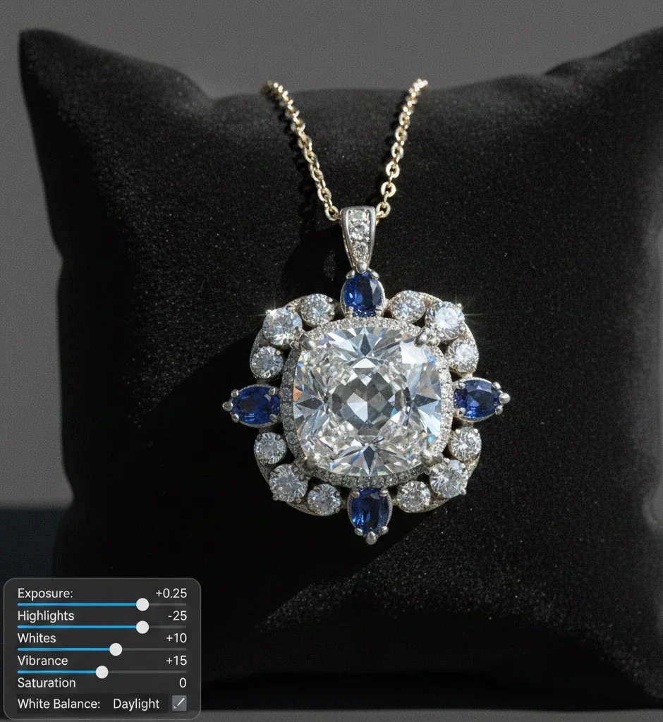
A good base edit usually includes:
- Correct white balance
- Controlled highlights
- Balanced contrast
- Gentle vibrance
Safe starting ranges (not forced):
- Exposure: +0.10 to +0.40
- Highlights: -10 to -40
- Whites: +5 to +20
- Vibrance: +5 to +20
- Saturation: -5 to +5
Avoid pushing saturation hard. Jewellery becomes fake fast.
6) Use the Histogram to Prevent Clipped Highlights
Jewellery photos often get ruined by blown highlights on:
- diamonds
- polished gold edges
- silver reflections
Your histogram should sit close to the right side, but not crushed into it.
If highlights clip:
- Diamonds become flat white.
- Gold loses premium depth.
- Details disappear when zoomed in.
7) Vibrance Over Saturation (Worldwide Safe Colour Boost)
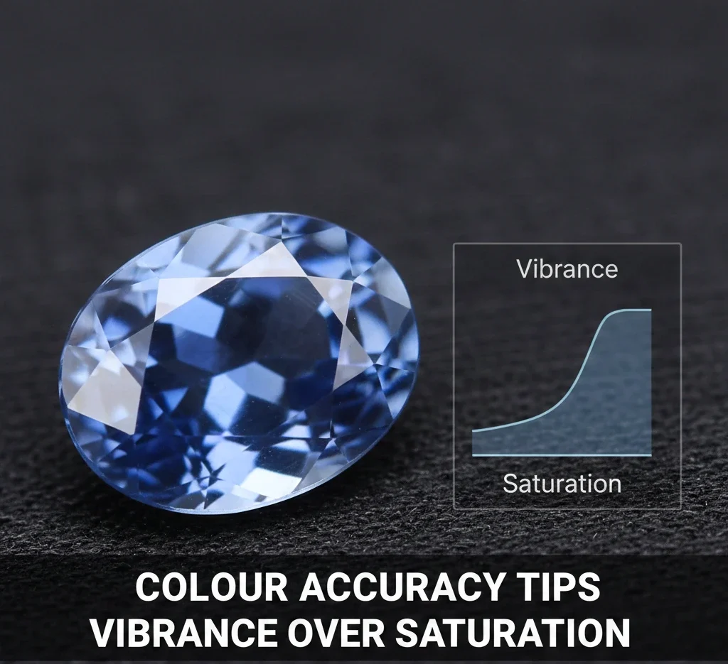
If your gemstone looks dull, your first instinct might be saturation.
That’s risky.
Better:
- Use vibrance to lift muted colours naturally.
- Keep saturation minimal for realism.
This keeps colours believable across different screens worldwide.
Colour Accuracy Tips for Jewellery Photography Editing in Photoshop (Pro-Level Control)
Lightroom handles global corrections. Photoshop is where jewellery becomes “premium”.
Photoshop vs Lightroom: Which Is Better for Product Editing?
8) Master the Lab Colour Space for High-End Jewellery Editing
Standard RGB editing can be destructive because changing colour often changes brightness.
For luxury jewellery, switching to Lab Colour is a game-changer.
In Lab Colour:
- L Channel: Lightness (detail and contrast)
- a Channel: Green ↔ Magenta
- b Channel: Blue ↔ Yellow
This means you can adjust hue without destroying highlights.
Example:
- Fix yellow gold tone without washing out shine.
- Improve diamond “fire” without flattening contrast.
- Correct gemstone hue without killing depth
This is one of the most advanced colour accuracy tips for jewellery photography editing used by high-end retouchers.
9) Localised Colour Correction With Masking (Metal vs Stone)
Jewellery often combines multiple materials in one product:
- platinum setting + yellow diamond
- rose gold band + white diamonds
- yellow gold + emerald stone
Global edits fail here.
If you warm up the diamond, platinum becomes dirty.
If you brighten the metal, the gemstone loses depth.
Correct method:
- Mask the metal separately.
- Mask the gemstone separately.
- Adjust each part based on its real material behaviour.
Tools you can use:
- Select Subject (Photoshop)
- Pen Tool for precision
- Object Selection Tool
- Layer masks with Hue/Saturation and Curves
This gives you clean, controlled realism.
10) Fix Gold Tone Without Making It Orange
Gold accuracy is a major trust factor.
Yellow Gold
Should look warm and rich, not orange.
If it looks orange:
- Reduce yellow saturation slightly.
- control red in highlights
- Remove warm cast from reflections.
Rose Gold
It should look soft and premium, not like pink plastic.
If too pink:
- Reduce magenta slightly.
- Restore warmth using yellow balance.
White Gold / Silver
Should look bright and clean, not blue-grey.
If too cold:
- warm white balance slightly
- reduce cyan/blue cast
- Keep natural contrast so it doesn’t look flat.
11) Make Diamonds Bright Without Losing Detail
Diamonds need:
- sparkle
- contrast
- sharp edges
- micro-reflections
The biggest mistake is pushing exposure until diamonds turn into white blobs.
Better approach:
- Lift whites slightly.
- protect highlights
- Add small texture for crispness.
Safe ranges:
- Texture: +5 to +15
- Clarity: +5 to +10
Too much clarity makes diamonds look harsh and unnatural.
Colour Accuracy Tips for Jewellery Photography Editing With Correct Colour Spaces
12) Select the Right Colour Space (sRGB vs Adobe RGB vs ProPhoto RGB)
One of the biggest mistakes in Colour Accuracy Tips for Jewellery Photography Editing is exporting with the wrong colour space.
Here’s the simplest worldwide-friendly breakdown:
| Color Space | Best For | Why |
|---|---|---|
| sRGB | Web, Shopify, Instagram, marketplaces | Most screens + browsers are built for it |
| Adobe RGB | High-end print & catalogs | Wider gamut (especially greens/cyans) |
| ProPhoto RGB | Internal RAW editing | Widest gamut, must convert before web |
Pro Tip:Always export jewellery images as sRGB with ICC profile embedded.
That keeps colours stable whether a customer views your product on an iPhone in Tokyo or a monitor in London.
Background Control for Accurate Jewellery Colour Worldwide
Background isn’t “just background”. It affects colour perception.
13) Keep Background Neutral to Prevent Colour Bleed
A warm background can make silver look yellow.
A green background can make gold look dirty.
For marketplaces like Amazon-style clean product shots:
- Use a near-white background (not harsh pure white).
- Keep soft shadows for realism.
Background brightness target idea:
- White background: RGB 245–255
- Light grey: RGB 230–240
Avoid dirty off-white that turns yellow.
The Best Export Settings for Worldwide Jewellery Colour Accuracy
Exporting incorrectly can destroy your work.
Recommended worldwide export settings:
- Format: JPG
- Colour space: sRGB
- Quality: 80–90
- Long edge: 2000–3000px (good for zoom + clarity)
- Sharpening: light/standard only
Avoid extreme sharpening because it makes metal look rough and cheap.
A Repeatable Step-by-Step Jewellery Editing Workflow (Fast + Accurate)
Use this workflow to scale editing without losing accuracy:
- Import RAW and enable lens corrections.
- Set white balance using a grey card.
- Balance exposure and protect highlights.
- Remove colour casts gently.
- Mask gemstones and correct hue naturally.
- Clean dust and scratches (keep real texture).
- Add controlled sharpness (edges, not noise).
- Match the whole collection to one reference image.
- Export sRGB + embed ICC profile
- Check on 2–3 devices before publishing.
FAQ
Why does my gold jewellery look green in photos?
This happens due to colour cast from surroundings. Green trees near windows or coloured walls reflect onto polished gold. Use a grey card and neutral lightbox walls to fix it.
Is Photoshop or Lightroom better for colour accuracy?
Lightroom is best for global corrections and camera profiles. Photoshop is best for localised precision using masks, selective colour, and advanced workflows like Lab Colour.
How do I know if my colours are web safe worldwide?
Use sRGB and always embed the ICC profile during export. This helps browsers display colours correctly.
Can I trust my phone screen for colour checking?
Not fully. Many OLED phones oversaturate colours. Use a calibrated monitor for final editing, and use your phone only as a secondary check.
What is the fastest way to keep gemstone colours consistent?
Use a Colour Checker Passport to create a custom camera profile, then apply it across your shoot for consistent gemstone tone.
Final Thoughts
Achieving worldwide success in jewellery sales requires technical excellence. When your 14K rose gold looks exactly like 14K rose gold on every screen, return rates drop and confidence rises.
By implementing:
- hardware monitor calibration
- grey card workflow
- colour checker profiling
- Lab colour editing
- correct export colour space (sRGB)
You transform your jewellery photos from “good” to retail-ready worldwide.