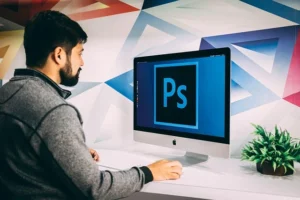
This not-so-difficult professional Adobe Photoshop tutorial will walk you through the creation of a simple but cool navigation bar and buttons that you can use on your website!
First of all, create a new document sized 500—300 px. All the default settings and my background gradient colors are #244e49 and #001e17:
Then apply Filter > Texture > Grain with similar settings to these:
Okay, now we have something like this one below:
Go to the next step. Time to add the grungy texture to the background. For this, you can use my brushes. Create a new layer and make a couple of prints using the Brush Tool and black color.
Make this grungy texture a little bit sharp. For this effect, use the Sharpen Tool like a graphic designer.
Now you need to make a curvy shape (it will be your navigation bar) using the Pen Tool and color #67716e:
After that, rasterize this shape with Layer > Rasterize > Shape and then apply Filter > Texture > Texturizer:
See the filter effect now:
Okay, to stylize this bar like designers are doing. Right-click your navigation bar layer in your layer palette, then go into the Blending Options, click, and apply the following settings:
Drop Shadow
Inner Shadow
Bevel and Emboss
Looking pretty good now.
Now, I would like to bring grunge texture to the navigation bar too. Now, select the navigation bar with Select > Load Selection, after that create a new layer, then select the Brush Tool and make a new print with grunge brushes.
Remove the selection with Ctrl+D, then use the Sharpen Tool again to make this layer sharp. Set the opacity to 50% for this layer.
Okay, begin to create a button. Select the Ellipse Tool and make a rounded shape like in the picture below:
After that, apply the following layer style for this layer:
Outer Glow
Inner Glow
Gradient Overlay
Stroke
Look at the picture below. Your button should look like this one:
Now it’s time to add a nice, glossy shine to the button icons. Start by making a selection around your Contract your selection by about 3 pixels again and press Delete to clear the selected Deselect this are
This is a satisfactory will see the difference.
After that, I glare at the button. Create a new layer, and then select the Pen Tool to create a shape for the future glare using white color.
Rasterize the current layer (Layer > Rasterize > Shape) and set opacity up to 40%. Now, use the Eraser Tool and a soft round brush of about 90 px to make this shape semitransparent a little bit on the bottom.
We are done with the button design. Now, you can add text. Use the Horizontal Type Tool to write out the button title.
You can duplicate this button five times and you will receive the next navigation bar with the menu:
My sincere thanks go out to everyone who has read these Photoshop tutorials. Let me know if you enjoyed it and if you learned anything!
