


Written by Steve Patterson. Adobe Photoshop is the world’s most powerful (and popular) image editor, trusted by both amateur and professional photographers everywhere to help their photos look their very best. With that in mind, it may surprise you to learn that Photoshop’s default color settings – that is, the settings that determine the range of colors and tonal values we have available to us when editing and retouching our images – are actually preventing our photos from looking the way they should, both when viewed on screen and when printed. In this tutorial, we’ll learn why the default color settings are not the best choice and which essential Photoshop color settings for photographers will give us better results.
Now, I could talk all day long about color theory and wish I still had more time, but I also know I’d risk putting a lot of good people to sleep if I did that. So in this tutorial, we’ll keep the technical stuff to a minimum and focus on what the correct settings in Photoshop’s Color Settings dialog box should be so you can start editing and retouching your images with your newly-expanded range of color possibilities. If you are interested in learning more about these color settings, I’ll be covering them in more detail in other tutorials.
I’m using Photoshop CC (Creative Cloud) here but these color settings apply to any recent version of Photoshop, so if you’re using CS6 or earlier and you want the highest possible range of colors for your images, you should still follow along.
Why It is Essential Photoshop Color Settings For Photographers?
Where To Find The Color Settings?
To get to Photoshop’s color settings, go up to the Edit menu in the Menu Bar along the top of the screen and choose Color Settings:
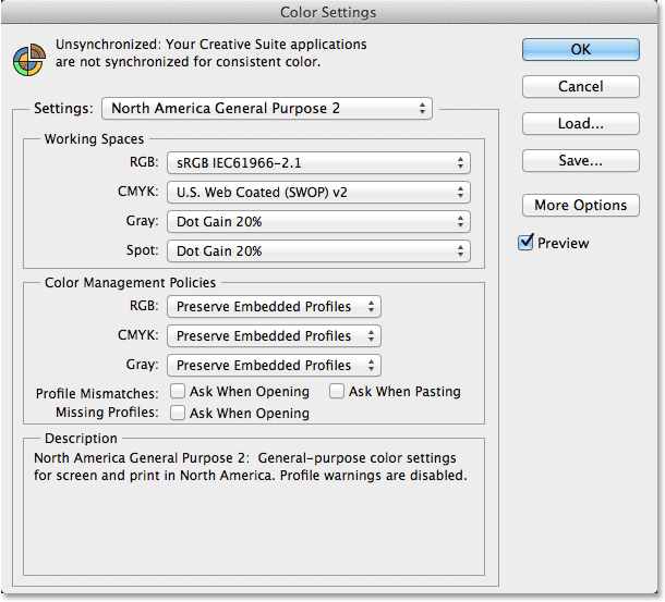
This opens the Color Settings dialog box. If you’ve never seen this dialog box before, and if you know nothing about color spaces and color management, it may seem a little intimidating. Don’t worry, though, because there’s only one important setting we need to change:
The RGB Working Space
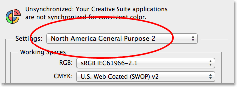
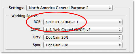
By default, Photoshop uses a preset collection of color settings known as North America General Purpose 2 (if you’re in a different part of the world from where I am, you may see something different but that’s okay because we’ll be manually changing the settings ourselves anyway):
If we look directly below the name of the preset, we find the Working Spaces section, and the very first option at the top, RGB, is where we tell Photoshop which color space we want to use by default when viewing and editing our images (there’s also options below it for CMYK, Gray, and Spot, but these deal specifically with printing. For on-screen image editing, the only one we need to worry about is RGB). A color space determines the range of colors and tonal values that are available to us. The color range of a particular color space is known as its gamut. Colors that fall outside the range of the color space are called out of gamut. For photography and photo editing, there are three main color spaces that we typically have to choose from – sRGB, Adobe RGB, and ProPhoto RGB. By default, Photoshop is set to sRGB:
Each of these three color spaces gives us a different range of colors and tonal values to work with, some larger than others, and it makes sense that we’d want access to the largest possible range when editing our images. Unfortunately, Photoshop’s default settings give us the exact opposite. The sRGB color space contains by far the smallest range of colors and tones. The Adobe RGB space contains a much larger range, while ProPhoto RGB gives us even more!
Learn all about RGB and Color Channels in Photoshop
To quickly illustrate the difference between sRGB and the next largest color space, Adobe RGB, here’s a graph showing a comparison of the two (the graph was created using Chromix ColorThink 2). The area in the center that’s filled with color represents the range of colors available in the default sRGB space. The colored outline surrounding it is the range available in Adobe RGB (unfortunately a 2D graph like this doesn’t include brightness values but it still gives us a pretty good idea of what’s going on):
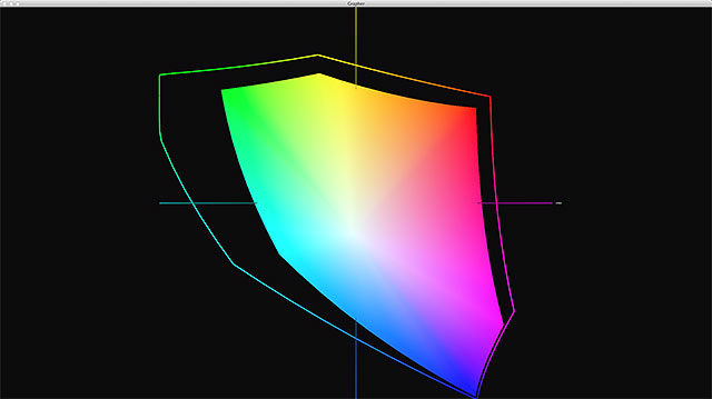
As we can see, even though sRGB does offer lots of colors, Adobe RGB offers the same colors, plus a lot more, especially in the greens and cyans. In other words, it has a larger gamut than sRGB. This means we’d have far more colors available to us when editing our images if we simply switched from the default sRGB color space to Adobe RGB. Why, then, would Adobe choose sRGB as Photoshop’s default?
The answer is simple – sRGB is safe. sRGB was designed to represent the range of colors that a typical low-end computer monitor (the kind most people use) can reproduce. Also, even though most digital cameras these days give us the choice of capturing our images in either sRGB or Adobe RGB, they’re set to sRGB by default and most people never change it (in fact, most don’t even know the option is there). Thirdly, if you usually send your photos off to a commercial lab for printing (as opposed to printing them at home with an inkjet printer), the lab will want the images saved in sRGB. So, if most computer monitors can only display sRGB, most cameras are set to sRGB, and commercial printing labs require sRGB, it makes sense then that Photoshop would choose sRGB as its default. It’s a safe choice.
If sRGB is safe, why not stick with it? Why choose something else? There are two main reasons why we’d want to select a larger color space. First, a larger color space means we not only have access to more colors but also more vibrant, richer, more saturated colors. Photos captured or saved in sRGB can sometimes look a bit dull and muted compared with images in Adobe RGB. Also, if you have a decent inkjet photo printer at home, there’s a good chance that it can print colors that sRGB can’t display, so your prints also suffer by not taking advantage of all the colors your printer is capable of reproducing.
Since sRGB is not the best choice because its color range is too limited, that leaves us with two other color spaces to choose from – Adobe RGB or ProPhoto RGB. As I mentioned, ProPhoto RGB contains an even larger range of colors than Adobe RGB, so wouldn’t that make ProPhoto RGB the obvious choice? Not necessarily, because having too many colors available can also cause problems, especially if you move an image from one color space to another. Since ProPhoto RGB has such a wide range of colors, many of them go beyond the limits of human vision. The conversion of a smaller RGB or sRGB image to ProPhoto RGB can result in overly saturated colors, noticeable banding or posterization, or even dramatic color shifts.
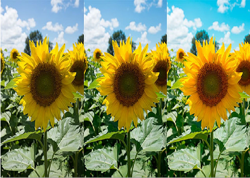
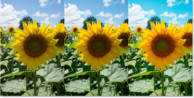
As an example, here’s a side-by-side comparison of the same photo assigned to each of the three different color spaces. The original photo (on the left) was captured, and remains, in sRGB. It actually looks a little drab compared with the version next to it (middle photo) which was assigned an Adobe RGB profile (we’ll learn all about assigning and converting to color profiles in a separate tutorial). Notice the more saturated colors that Adobe RGB produced, improving the photo’s appearance. The version on the right, however, again originally captured in sRGB, was assigned a profile of ProPhoto RGB. The colors are now overly saturated to the point of looking completely unnatural while some of the colors themselves have shifted. The sky in particular is now a completely different blue than what I originally captured:
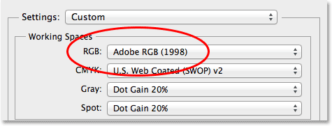
So is ProPhoto RGB not the correct choice? Is Adobe RGB better? The answer really depends on how you typically capture your images and how you use Photoshop. If, like most Photoshop users, you shoot and work primarily with JPEG files (which can only be captured in either sRGB or Adobe RGB) and you do most or all of your editing directly in Photoshop itself, then the best color space to choose is Adobe RGB. It’s large enough to encompass all the colors your computer monitor can display (even if you’re using an expensive high-end monitor) and most of the colors an inkjet printer can print. To change Photoshop’s RGB working space to Adobe RGB, simply click on sRGB and choose Adobe RGB from the list:
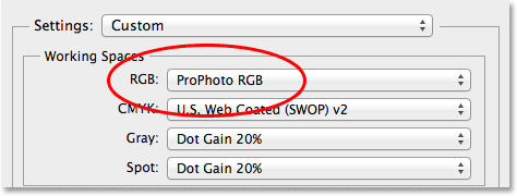
If, on the other hand, you typically capture your images as 16-bit raw files and you open the raw files in either Adobe Lightroom or Camera Raw for initial processing before moving them into Photoshop, you’ll want to take advantage of the greatly expanded color range that ProPhoto RGB offers. Adobe Lightroom also uses ProPhoto RGB as its working color space, while Camera Raw lets you manually assign ProPhoto RGB to an image. So by setting Photoshop to ProPhoto RGB as well, you’ll be preserving the image’s color information between programs and maintaining all the editing freedom and flexibility that ProPhoto RGB offers. It’s important to keep in mind, though, that ProPhoto RGB is really only beneficial if you’re working with images that were initially captured as 16-bit raw files. As we saw earlier, attempting to assign ProPhoto RGB to an image that was captured in sRGB or Adobe RGB can cause serious problems. That’s why for most people, Adobe RGB is all you’ll need to get great results with your images, both on screen and in print. But, if you do shoot or work with 16-bit raw files, ProPhoto RGB will give you the best results:
Raw vs JPEG for photo editing
What To Do With Color Profile Mismatches
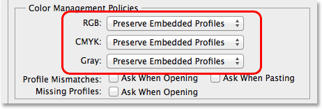
So far, we’ve learned that the sRGB color space (Photoshop’s default setting) is not the best choice for editing our images because of its relatively small and limited range of colors and tones. Adobe RGB is a better choice for Photoshop users who shoot and work with JPEG files, while ProPhoto RGB is best for images originally captured as 16-bit raw files. But what happens if you set Photoshop to one color space and try to open an image that was saved in a different color space? For example, let’s say you’ve set Photoshop’s working space to Adobe RGB but someone sends you a photo to work on that was saved in sRGB? Should it remain in sRGB or be converted to Adobe RGB? We need to tell Photoshop what to do in these situations, and we do that using the options in the Color Management Policies section of the Color Settings dialog box. Once again, we have options for RGB, CMYK, and Gray, but as I mentioned earlier, CMYK and Gray specifically deal with printing. The only one we really need to be concerned with for image editing is RGB.
Fortunately, we don’t really need to be concerned with these options at all because, unlike Photoshop’s RGB working space setting, the default settings for the Color Management Policies are actually correct. In pretty much every case when a photo’s color profile doesn’t match Photoshop’s working space, you’ll want to preserve the original color profile. If you convert the image to Photoshop’s working space, you run the risk of changing the original colors in the image, and that can leave people – especially clients – none too happy with you. By preserving the color profile that’s embedded in the image, we keep its original colors intact. That’s why the default setting, Preserve Embedded Profiles, is the one you’ll want to stick with:
Now that we’ve told Photoshop to preserve the photo’s original color profile whenever there’s any sort of mismatch, the next question is, do we still want Photoshop to notify us whenever there is a mismatch? If we say yes, then each time the image we’re opening has a different color profile than our working space, Photoshop will pop open a warning box like this one, which not only makes us aware of the mismatch but also gives us the chance to override the default behavior:
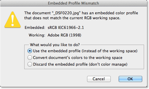
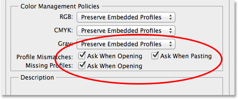
As we’ve already learned, there’s usually no reason why you’d want to do anything other than preserve the photo’s embedded color profile, so the issue here becomes whether or not you simply want to be notified that there is, in fact, a mismatch. Personally, I’m a big fan of information so I do like to be notified even though I do nothing about it other than click OK to close out of the warning box. If you’re like me and still want to know when it happens, select the Ask When Opening and Ask When Pasting options to the right of the words Profile Mismatches by clicking inside their checkboxes (Ask When Pasting is for when you drag or paste an image from one document into another and each document is using a different color profile). You’ll also want to select Ask When Opening for Missing Profiles for those rare occasions when you’ll come across an image that doesn’t have an embedded color profile at all. If you don’t want Photoshop to notify you about these things, that’s fine too, since you weren’t going to do anything about them anyway. In that case, simply leave the boxes unchecked:
Saving Your Settings
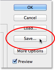
Once you’ve made your changes, it’s a good idea to save your new settings so you can easily switch back to them again if needed. To save them, click the Save button:
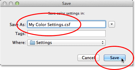
Give your custom settings a name. I’ll call mine “My Color Settings”. Click the Save button again:
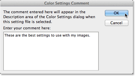
Another dialog box will appear, this time giving you the chance to enter a description for your settings if you like to serve as a reminder of what these settings are for. I’ll enter “These are the best settings to use with my images”, but you can enter something different, or simply enter nothing at all. You can close the dialog box by clicking OK when you’re finished:
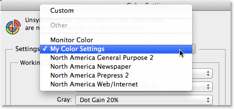
Once your custom settings have been saved, you can select them again at any time from the Settings option at the top of the Color Settings dialog box (the option that was initially set to North America General Purpose 2):
And there we have it! That’s how to expand your range of color possibilities and get the most out of your images with a few simple but essential changes to the default color settings in Photoshop!